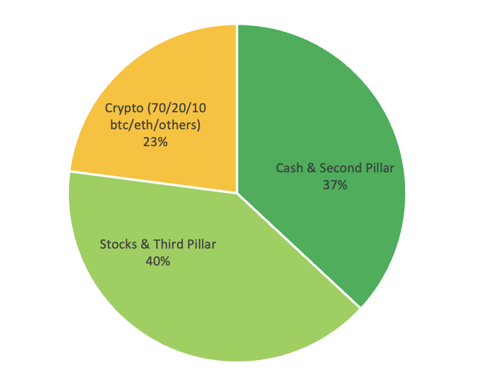
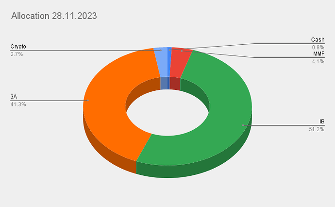
Love that flow visualization over the years!
What happened in April 2019?
Which April is 2019? ![]()
The one before April 2020 ![]()
Too bad it’s only +127% YTD ![]()
An old Chinese proverb says: 有時需要雙球並全力以赴。
Which means : Sometimes it’s necessary to have a pair of balls and go all in.
No Pillar 2? ![]()
(20 stupid rule)
I added 3A to my balance sheet after reading this thread and realized that I had finally reached 10k in net worth. Thanks guys.
I feel that the order of magnitude is wrong… Unless you are talking about BTC or ETH or VT units, of course.
He seems to be a 20 y/o apprentice. ![]()
Great start then!
You have a great early start. I was 25 when I reached 10K.
Also, listing 3a as a separate asset type is just wrong. You should parse it to what is inside. Unless it is (almost) 100% stocks, like some allocations imply.
Your comment made me think that I should definitely add the year after the month so that the visualization on the graph is easier ![]()
April 2019:
I changed employers and receive a substantial amount of money as compensation for my overtime.
April 2020:
Basically I was shifting my allocation towards cash because I was potentially buying some RE in the last months. “Luckily” we didn’t buy the appartment and I therefore was reallocating my cash to shares during the Corona crash (at approx. the best time possible ![]() )
)
Four different blue colors… I was able to identify assets only by their order in the sequence.
P.S. had anyone thought about taking gross values of assets but normalizing them to the total net value? So that the sum is > 100%. Like this, you can see the leverage across the whole portfolio.
Not sure what you mean, but what if you just took gross assets and ignored all liabilities and then do your pie on that (pie automatically makes sum 100%).
And this is exactly what I want to avoid.
I haven’t done a nice graph, but here are my numbers: allocation percentages as gross values divided by total net wealth value:
Cash 11%
Pensions 40%
Stocks 44%
Home 58%
There is a debt linked to purchased stocks and RE.
This debt is not assigned specifically to individual asset classes, but attributed to the whole portfolio. At the same time, I can see that my leverage ratio is around 1.5, which is less as I thought and not bad, I think.
This representation allows me to see both gross values of asset classes and take into account debts.
Just an idea, anyway.
I still don’t quite understand what it is you are trying to do. Let’s do a simple example:
house 1000k market value. 500k mortgage on it.
shares 1000k value. 200k margin on it.
for the chart i would do:
house 50%
shares 50%
is that what you’re trying to get to? if so, you can get there by ignoring the debt.
if not, can you say what you want the pie to look like for this example?
If you want to express leverage, I’d just state the debt as proportion of gross assets. In this case 700/2000 = 35%.


