What I find interesting is that VIX peaked on January 24th and haven’t reached this level anymore. So yes, rates are going up, valuations are going down, but we seem to be far away from a real panic. Means something unexpectedly bad.
Given that inflation is being expected since a couple of months (which the war on Ukraine has exacerbated in energy prices) after significant monetary expansion.
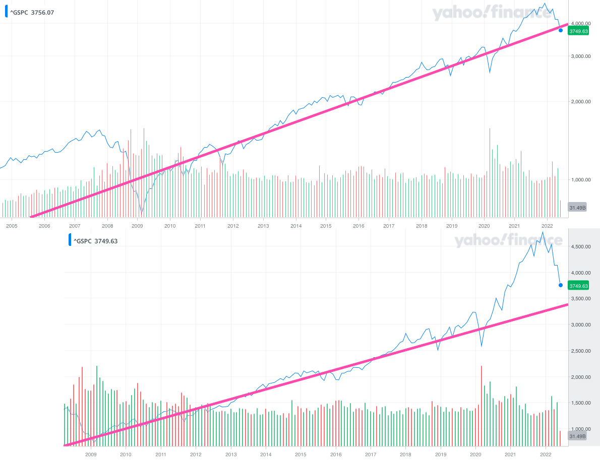
Coming from one of the hugest and most unexpected (from March 2020) rallies in history, stock prices seem more on a steady reversal to the mean.
I don’t really think it’s unexpected (anymore) at this point, is it?
PS: you could employ an illiterate ape to do your chart analysis by superimposing a straight line over your MSCI World or S&P500 index chart for the last 5, 10 or 15 years - and he‘d agree everything looks quite normal. We seem to be not more than 10% or 15% above that long-term trend line at this point.
I love illiterate apes, they perform just as well as active managers. Actually, I’d rather have the ape be my manager due to lower fees.
And I also love financial charts. It’s just like in kindergarden: You can draw anything you like, it doesn’t have to make much sense, and you will never be held accountable for what you’re drawing.
So a chart-drawing ape is just the culmination of it all
Well, if you could be a bit better and plot index in a logarithmic scale, that would be even correct theoretically. The increase should be exponential.
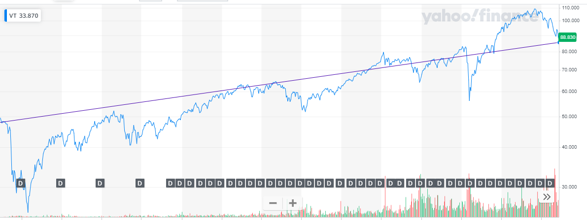
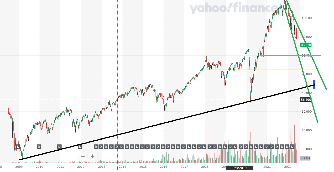
I tried my best but the base chart is bad, also the timeframe might be to long. Black we see the long term support line.
Green the channel in which we currently are, the downtrend is as fast as the uptrend.
Orange the horizontal support lines. It looks like there is some support at 80 and 70 USD.
If i believe my chart we will test the black line at the and of 2022 or beginning of 2023.
Ok, let’s be a bit more serious.
With that span (2008-2022) you don’t see the candles very well.
Also I’m not sure where you should start the trendline.I suppose it should balance top/bottom (duh).
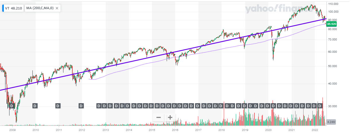
I’ve put the 200days moving average, which is starting lower. Why?
In TA you draw the upper or lower trendline indicating support & resistance. Yours is just a worse moving average since you cut trough the middle.
Look at my edited chart, i tried to explain it a bit.
The 200 days starts at the beginning (inception of VT) and takes into account the 2008 crash.
The whole idea of “reversion to the mean” makes no sense to me.
“The market will revert to the mean in the future, ignore the ups and downs.”
But to which “mean”?
You can pick whichever historical period you like to fit your line and project forward, but you surely won’t “see the future”.
As we can witness in all the random attempts already in this thread , it’s a futile non-actionable exercise.
Thanks for both post.
Hopefully no one will think you were too harsh.
I don’t get why you say “the base chard is bad”. Does it mean that you can’t measure trends of more than a couple of years?
Also how do you define the two orange support lines? And what’s their role? From an ignorant point of view, it looks like we try to guess shapes from a graph.
Regarding my line: I think that is what a normal (aka ignorant on the field) person will do. It’s a simplification of the curve.
Mit dem Lesen und der Teilnahme an diesem Forum bestätigst du, dass du die Forum-Richtlinien gelesen hast und damit einverstanden bist sowie den Haftungsausschluss auf http://www.mustachianpost.com/de/ akzeptierst.