
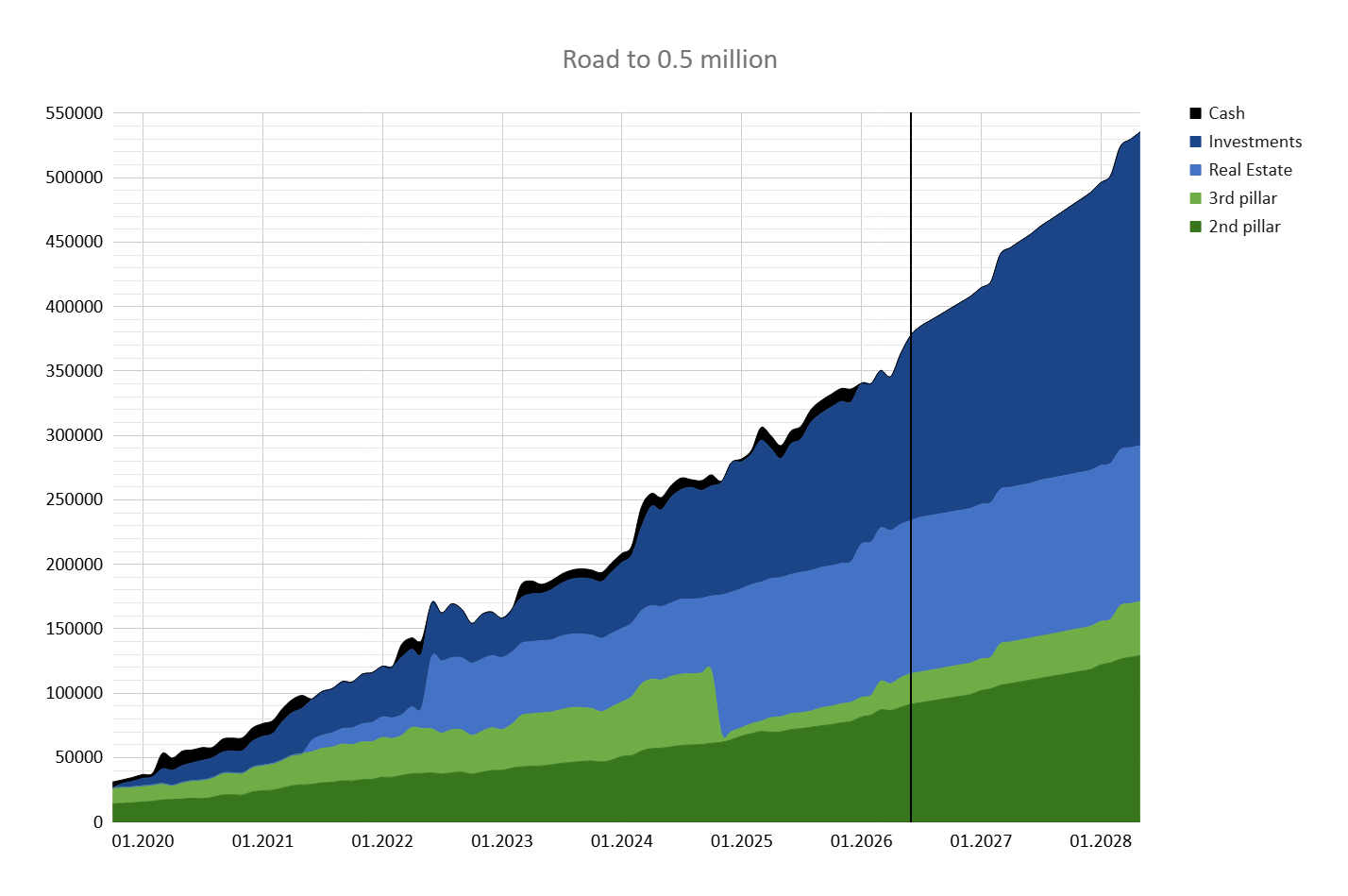
Made good progress in the last 2 months. Would be great to hit 500k by end of next year.
13 Likes
Looks like the investments are doing the heavy lifting, but could be more clear if the chart wasn’t stacked.
1 Like
so little cash?
Yeah decided that I won’t hold any cash at all for the foreseeable future ![]()
Btw @PhilMongoose do you have a better solution for showing networth progressions?
2 Likes
Personally, I like to show each line separately and one for the total.
1 Like
I tried that but it didn’t really look good. What about putting cash at the top and thus making it look less choppy?
Maybe this makes the most sense as you go from the highest liquid asset to lowest.
3 Likes
Still looking choppy. Stacked graph is readable for the whole amount, not the individual sections.
Line charts are more suitable (imo).
did you keep your 3a in cash or why the non-appreciation? looks like it’s a flat angle upwards. If you keep paying in, I’d assume you’d be in an Equity-100 plan, and more appreciation over the first 5 years before you bought property.
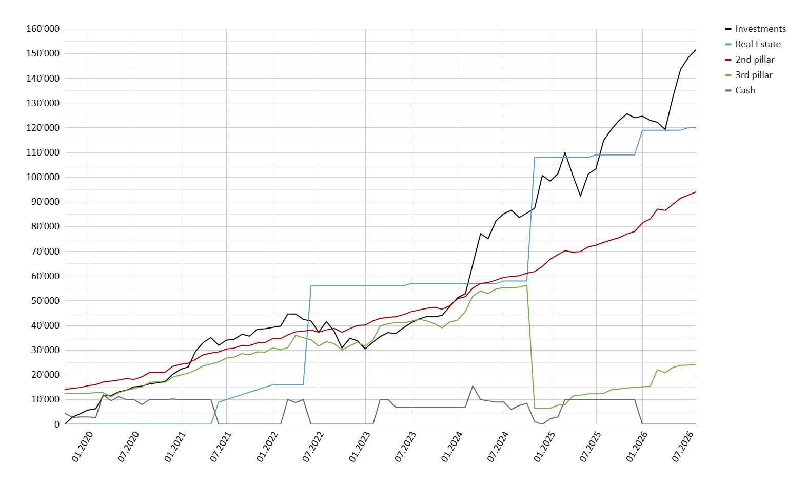
I cannot read the colours very well. I find the lines to thin.
![]()
1 Like
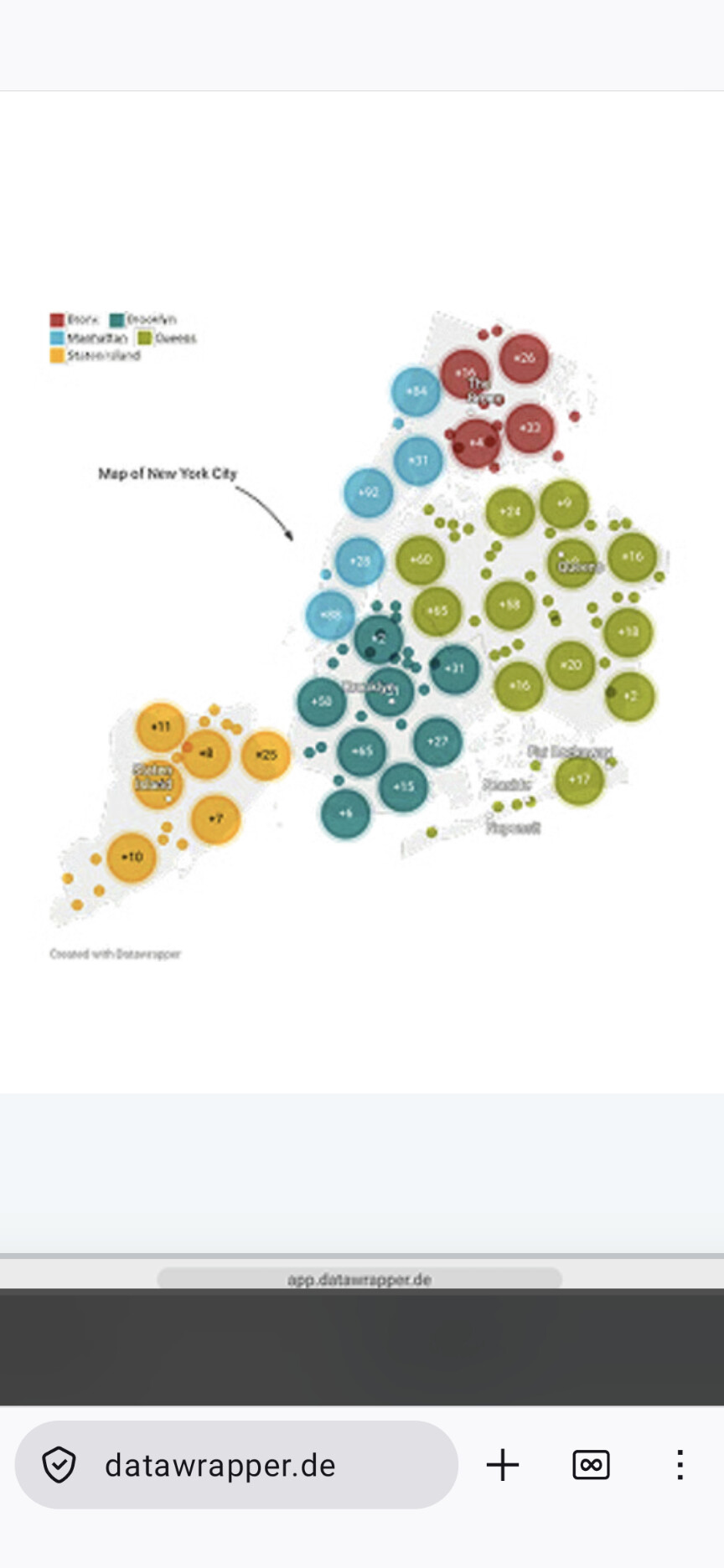
Someone could do a heatmap of the earth (or CH au choix) with % of FI achieved per region
Or actually just a two colour map where the regions one attained FI in turn another colour.
@Cortana agree with line thickness and also I would add the total.
2nd pillar steady and ‘investments’ rocketing up. nice.
I think it’s very clear when you visit this site on your PC and can open the graph in its full size.
1 Like
Milestone reached at the end of May: Net Worth crossing the CHF 3M mark for the first time (up 160k since the beginning of 2026).
25 Likes
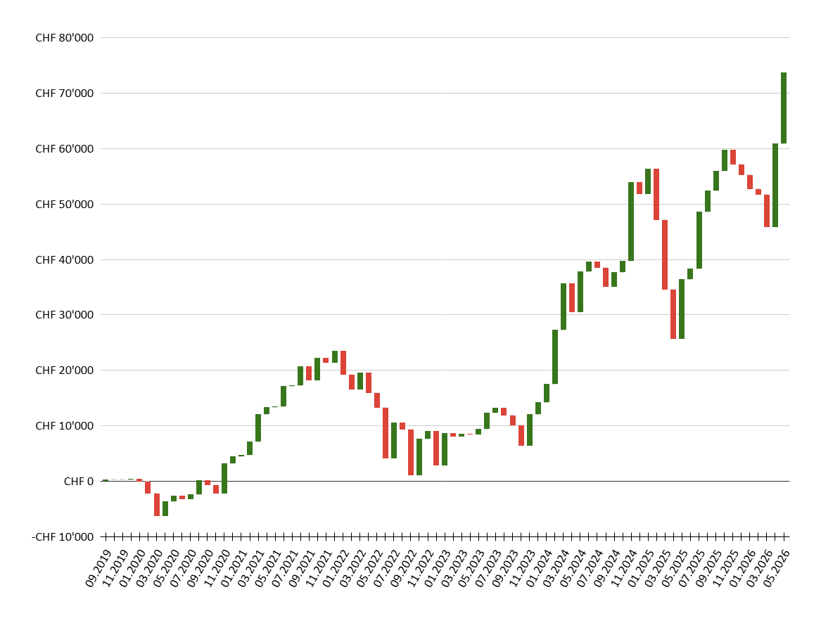
Markets have been really good in the last 2.5 years. It also made me realize what part of my NW progression was due to those returns:
12.2023: 208’000 NW
+83’000 savings
+59’500 returns
+30’500 pension fund
+3’000 RE equity increase (lower capital gain tax)
06.2026: 384’000 NW
I should clearly save more though. I’m constantly underachieving my target saving goals.
Edit: After revaluating the past 2.5 years, I came to a conclusion I wasn’t even aware of. I bought a new motorcycle, clothing, helmet etc. + maintenance costs. That was 16k in total. I split up with my GF and moved into a new apartment end of 2024, bought furniture etc. for roughly 9k. Then some tech stuff like NAS, Macbook, speakers, monitor, DJI drone. Probably 30k in total. I guess 50k/y savings potential looks nice on paper, but then there is reality.
5 Likes
I’m actually surprised your gain was so little. I thought you’d invested with leverage and/or with leveraged products?
The unleveraged S&P500 gained 54% in this period so I was expecting that you would have done better than that with leverage.
I think that’s a healthy balance. Esp. if you keep that spending at 30k while wage increases drop down to additional savings.
My total return was around 45% (in CHF) in those 2.5 years. I never had a big UPRO position, currently 17k in UPRO.
1 Like
Genuinely interested, why UPRO and not margin loan?
Interest is still deductible from taxable income