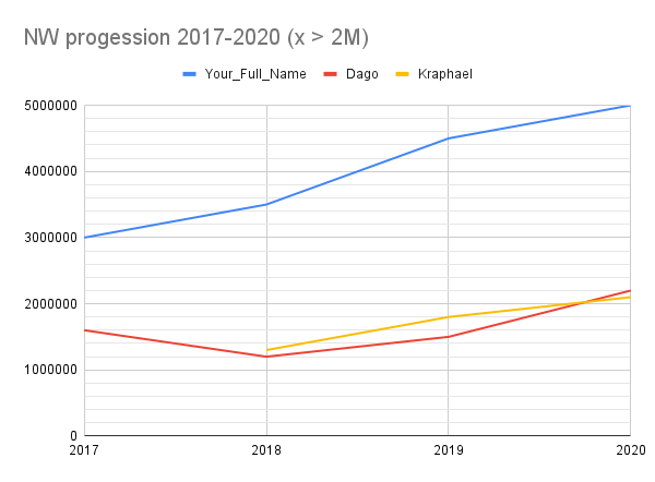
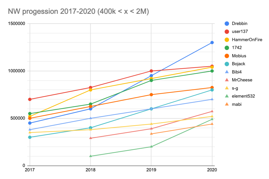
As explained in my post, I really like this thread. So I wanted to make more sense of the numbers available here and plotted them ![]()
Everything in the same chart is blurry so I distinguished 3 categories of NW, split them with the NW of 2020, and here they are:
- NW bigger than 2M in 2020
- NW between 400k and 2M in 2020
- NW lower than 400k
Category 1:
Category 2:
Category 3:
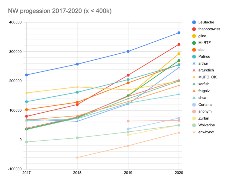
Note: some numbers are estimations extracted from your charts, it may vary a bit from the reality, sorry for that. Contact me if something is wrong, I’ll change it.
I find it nice to see the numbers like this, what do you think ? And it can maybe create “competition” between similar NW in the future. I mean competition in the good way, like a gamified NW evolution. ![]()