I rewatched it a couple of days ago. It starts off a bit too relevant for confort and the ending is kind of rushed, but still enjoyable (for a quarantine).
Got it recently recommended by a teammate. It’s like this virus, just much more fatal.
1 Like
I watched it for the first time a couple of days ago.
The beginning was pretty well done. And the movie uses a cool way to “treat stars” to reflect the reality of a virus. Also it was pretty cool how they visualised some of the lab microbiology.
I found the movie really lacking in many other regards (some light spoilers):
-
The virus spreading so fast made not a lot of sense. The incubation time of the virus is at most 1 day and this would normally mean that most people would not have a lot of opportunities of infecting others. And it would also be really quite easy to contain such a virus (shelter in place for 4 days). The government and society seemed to also act in a way that was kind of stereotypically bad.
So all of the drama felt somewhat artificial and required a LOT of suspension of disbelief. -
What we see is often not what we’re told. We see everyone dying without much of a fight after being infected for a couple of days. Then we’re suddenly told that not even 1/3 of the people die from the virus. But we’re never shown anyone surviving or anything. This felt kind of weird and contradictory.
-
The movie should have just dropped some story lines (Marion Cotillard or the CDC boss’ wive) and/or have been 40 minutes longer. I wasn’t really able to indulge into any of the characters or plot lines because everything was shown in such a minimal way. There was soo much potential there but I feel a lot of it was missed.
3 Likes
Another take on the data. Their takeaway: compare new cases to total cases, do not plot against time.

7 Likes
Yesterday, I’ve read an interview with a Chicago economists who was saying that if US ramp up testing and contain the virus in Q2, then in Q3 and Q4 we might see quick recovery.
Here’s the link:
https://www.barrons.com/articles/raghuram-rajan-says-the-u-s-can-avoid-a-worse-financial-crisis-51585346292?refsec=interview

These are the Superspreaders!
3 Likes
Damn, this lockdown might last for months.

If you look in China it took two month to recover. I think that this sets the time constant with which you have to calculate.
But China took much more serious (and much earlier) measures than Switzerland, so I’d expect it’ll take much longer.
And nobody really knows if China publishes real numbers.
9 Likes
I recommend the classic “Outbreak”.
I played a bit with the data. I counted weekly cases (new cases from last 7 days) and total cases (up to a given date) and then calculated severity (weekly cases / total cases). I think it illustrates nicely the dynamic of the change, without the need of log scaling. I think it’s important to note that once the severity starts dropping, it continues to drop (with the exception of Iran).

1 Like
I don’t think China would be able to hide it if they were not able to contain it.
The recent data from Switzerland make me optimistic. The current measures seem to work, measures taken before the 15. March seem to have worked as well. Daily new Deaths raise slower than in the beginning, even thought we would expect the effect of the lockdown light to begin to show at the end of this week. It looks like the first wave will “only” cause a few thousands to die.
The daily new cases suggest that R is down to around 1. But there is still quite a bit of uncertainty. I tend to expect it to fall a bit as the lag between the effect of the lockdown light and it showing in the data is not completely over. (3-10 days incubation period for 95% of cases to show symptoms, time between symptom onset and test(2-3 days?), time between test and result(1 day?) and time between the result and report in the numbers(1-2 days?)).
1 Like

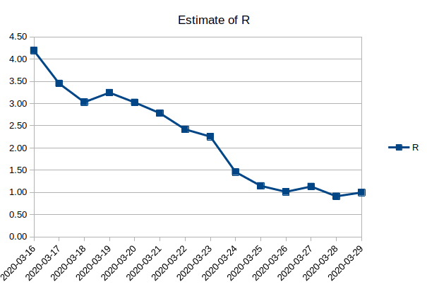
Here is my estimate of R. It is bases on the difference of daily new cases of the moving average of 5 days to the average 5 days ago. I’m not sure that this is a valid way to make such an estimate because even with a R of 1 you would expect daily new cases to raise slowly for some time because more people get infectious.
I assumed a mean generation time of 5 days.
I used data from GitHub - daenuprobst/covid19-cases-switzerland: Data from BAG Tweets made useful. and interpolated missing data linearly.
2 Likes
Nice. I was also considering if it would make sense to put weights depending on how many days ago it was. Today weight 5, yesterday 4, then 3, 2, 1 and finally 0.
There is quite a bit of randomness in daily new cases. It is also different how cantons report the data. Some cantons just put a number on their page with a time when it was updated. Some report the data for a date on the next day and sometimes they don’t report data at all for a specific date. That is why I interpolated all data from the cantons.
Reports in cases are quite imprecise. (mostly due to lack of full testing everyone)
So are the death tolls. (because “preexisting conditions”)
Perhaps the closest estimation of the real effect can be made by “hospitalizations due to coronavirus”.
But for those numbers we need proper reporting directly from hospitals etc., which is probably hard to come by.
And even more so globally (vs. in super developed countries).
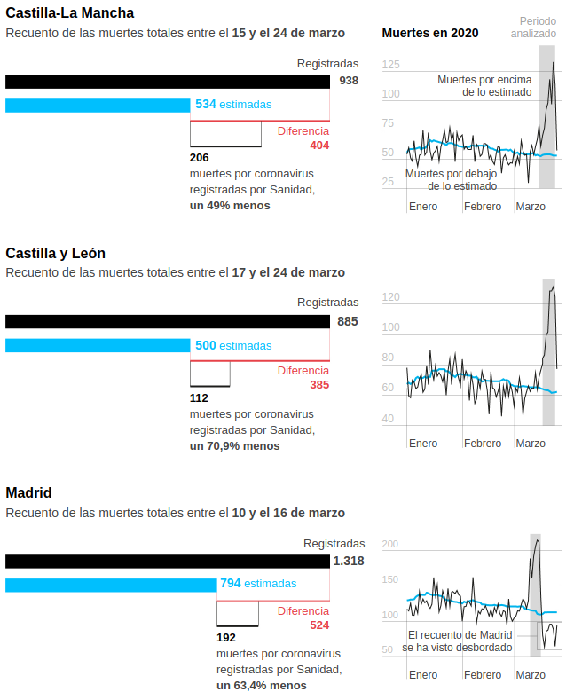
In Spain there’s a “Daily Mortality Monitoring System” that predicts how many people they expect to die of all causes and then looks for deviations. They’re not using that to see the real impact of covid, which is way higher that the official covid death numbers.
These graphs show, for three different regions, the total number of deaths registered (black) and the estimated deaths (blue). They also show how many are officially counted as covid deaths and how many are unaccounted for. The recent numbers for Madrid are untrustworthy because they are completely overloaded.
1 Like
Do not trust deaths rate from China. There is a report that the local government is preparing as much as 45000 urns to send the remains of the deaths to the families. So either they split the remains to various famiies or there are at least 45000 deaths.
2 Likes