Some guy at some forum laughed at me for believing that by holding stock I’m an owner of a part of a business, a productive asset. He said he puts his savings in gold.
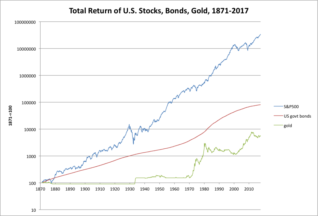
After that I googled for some comparison of return between stocks vs bonds vs gold, and found this:
If you’re looking since 1870, then stocks are crushing bonds and gold. However, as the author mentioned, there is a significant survivor bias, as we are looking at the most successful stock market in that period, not struck by serious turmoil.
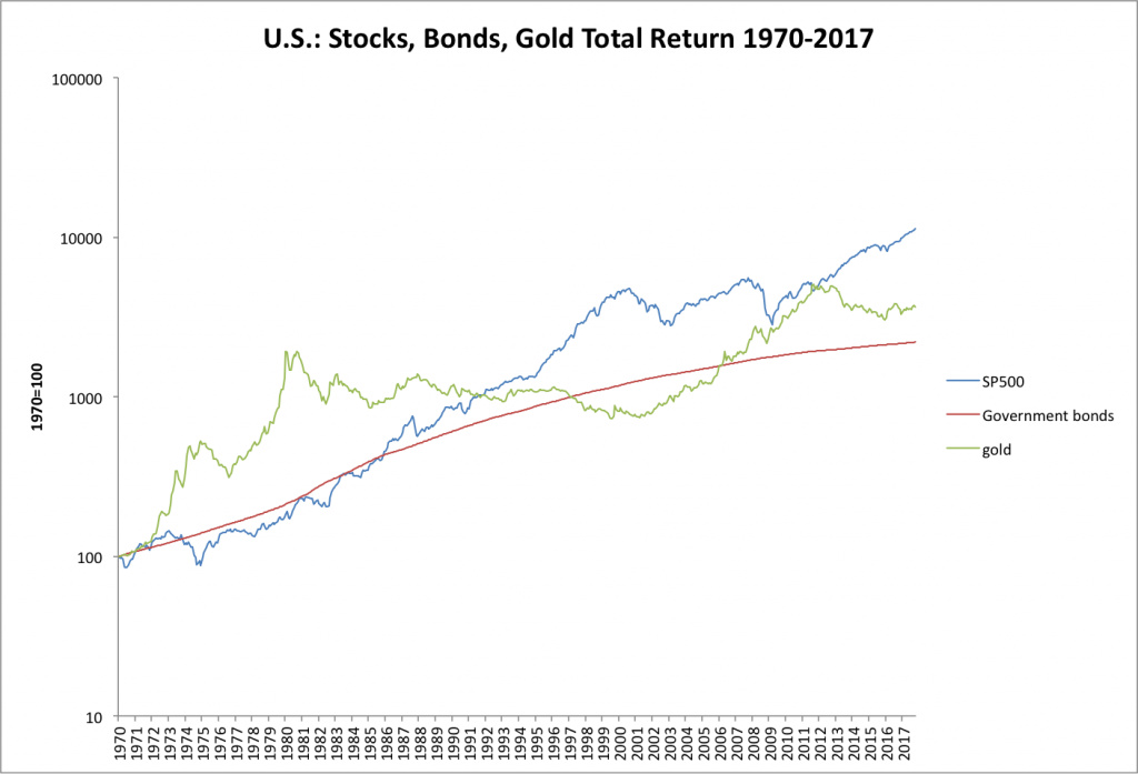
But if you look since 1970 then a different picture appears. When the dollar lost its peg to gold, people jumped on the gold bandwagon. It would seem logical, since people could have lost trust in cash, which could have been since then printed freely, causing inflation.
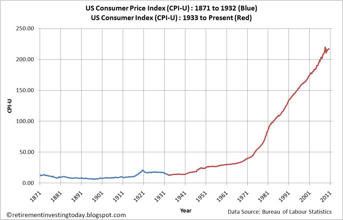
What really disappoints me, is that the return of S&P 500 has been stable in nominal terms. But since 1970 a big chunk of this growth is just inflation.
Well the graph’s legit but he’s cherrypicking his timeframe all too well as well. Gold essentially had two (or three) major periods of stratosperic growth: notably the 70s that you already mentioned and late 2000s, the banking crisis, while at other times it was mostly laying dormant or losing value.
Here’s a graph that tells a different story - trailing 30 year total return of S&P500 vs gold:
Of course, you’re right. I was looking for logarithmic aggregated CPI, but couldn’t find it. Showing trailing 30y return makes a lot of sense, the CPI too. It’s crazy that $100 invested in 1970 were nominally worth $5500 in 2000. But since aggregated CPI was 5, the real value was $1100. This corresponds with what I find on dqydj.
Mit dem Lesen und der Teilnahme an diesem Forum bestätigst du, dass du die Forum-Richtlinien gelesen hast und damit einverstanden bist sowie den Haftungsausschluss auf http://www.mustachianpost.com/de/ akzeptierst.