Posted yesterday by the Financial Times
This figure is misguiding and misses the point completely.
What is the point in your opinion?
The title is bad, the picture is fine ![]()
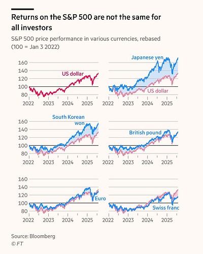
The picture suggests that somehow you could have earned more if you invested into S&P 500 denominated in Korean Won than in USD.
The real point is that the same asset, which Performance is expressed in different currencies, will have the same performance after recalculating to the same currency. The difference that you see is just FX change, you might as well just plot USDXXX pairs.
For someone with natural science background it is so straightforward, I am always amazed why people don’t see it. FX rates are just conversion coefficients, but they are floating.
The title sounds ok no? Investors in different countries got different returns in their local currencies.
Does anyone have the link to the article for context?
Technically yes, but it bundles together S&P 500 and USDXXX performance, which are two independent factors, I would say. Why not express S&P 500 Performance in prices of Big Mac Heineken beer in every country?
Okay, I finished venting.
I think it would be interesting to see what FT is actually trying to say.
Of course investors should always measure returns in their own currency because their alternative is to leave money in their savings accounts.
Looks like it’s from When it comes to returns on the S&P 500, it’s not just what you buy that matters, but where you buy it. | Financial Times
afaict the point is that SP500 isn’t massively positive for every investor (depending on their currency).
I disagree that it is misleading. It would be if there was some conclusion like “You should buy the S&P500 in Yen!” or some such nonsense.
As a Swiss investor, it is indeed relevant how much my net performance was, no? That USDCHF is indeed independent is irrelevant.
If anything, this chart should be unsurprising.
