I asw this chart:
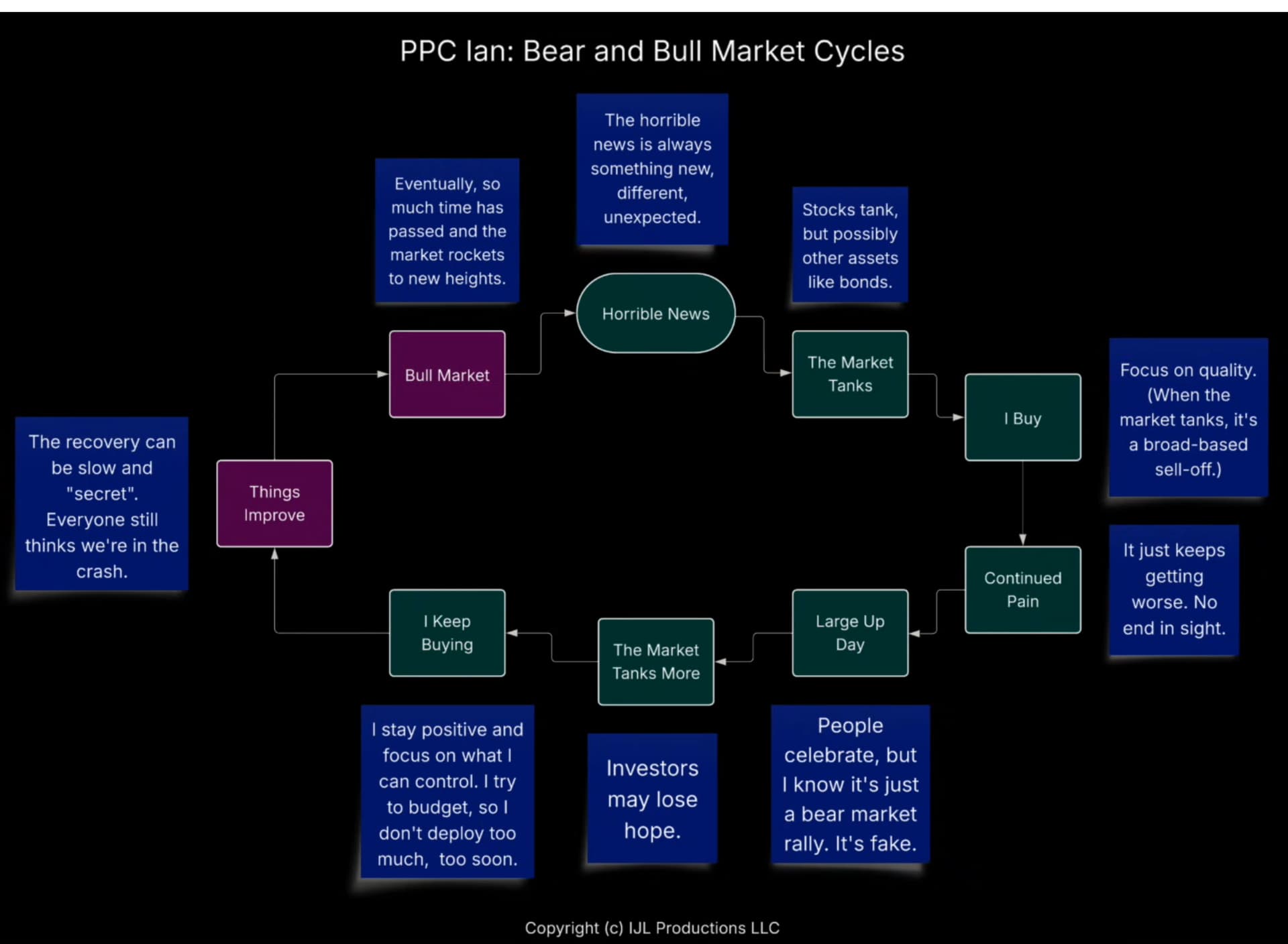
I think it is largely correct, but I think we’re in a cycle where the next step from “I keep buying” goes directly back to “Horrible news” to continue the bearish cycle.
I asw this chart:
I think it is largely correct, but I think we’re in a cycle where the next step from “I keep buying” goes directly back to “Horrible news” to continue the bearish cycle.
I threw Gemini AI at your flow chart because market timing with AI must surely be even better:
(a hundred TPUs* used 10kW of entirely recycled electrons to generate the image above)I was impressed with the Gemini 2.5 Pro model. Though I see I didn’t really miss anything by not checking out their image generation offerings ![]()
Yes, I did.
Your average is OK, but with other numbers you could have gotten way better numbers.
But always in the past.
That is exactly what I hate about my model: too little data.
I made money 3 out of 3 times, that means almost nothing. But I will try again…
I didn’t have an average though, @oslasho had CAGR which is probably more informative, however I will play around a bit more carefully.