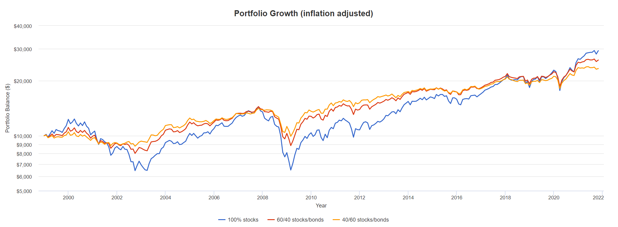
Sorry for off topic, but what I find amazing in this last simulation is that it is actually 100% stocks portfolio that preserved real value, two others with bonds have lost it.
what a nice tool, thanks @Wolverine!
Fascinating is that if you extend the time horizon to before the dotcom crash, 20 years later in March 2020, everything is again at the same point:
So according to this, my theory would be:
- stay invested in 40/60 stocks:bonds
- wait until a stock market crashes and ride it out with the 40/60 portfolio. The stocks portfolio will be more volatile and thus undercut the 40/60
- somewhere along the bottom of that wave*, switch to 100% stocks on the first real sign of economic rebound, until the stocks portfolio catches up its minuses (which it will much faster), then sit back to your cozy 40/60 and wait
- wait for the storm and repeat
*Now only if we could know where the bottom is ![]()
zooming out to 27 years (max the graph can do) would still be OK with this approach
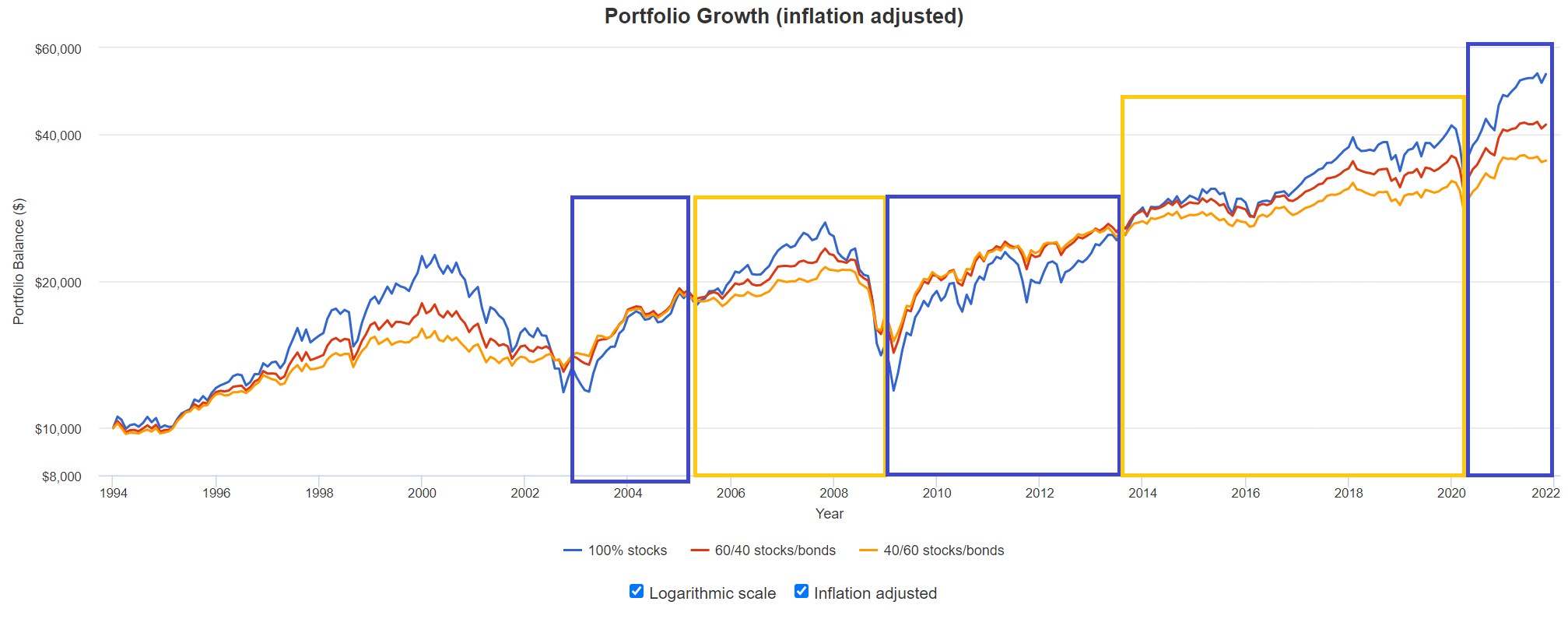
blue brackets above are 100% stocks, orange brackets are 40/60
it’s not trying to guess where the top is and the last 2 years are a bit shaky cause the stocks portfolio didn’t fall under the stocks portfolio, so ideally you would’ve not switched and now you would sit in a 40/60, still.
that’s where the theory might break ![]()
2 Likes
I actually roughly ran the numbers based on the chart above.
If you watch closely both first and second switch to stocks had a false positive and was plunging afterwards a little more.
However, you are still coming out on top and arrive at a level of… drumroll - about the height of the red line 
Personally, I find that the two portfolios including bonds, especially the 40:60 portfolio weathered the situation best!?
I was talking about the final balance and the fact that two portfolios with bonds lost inflation adjusted value.